Color palettes in interior design set the mood and style of a space. Here are some popular interior design color palettes and their effects
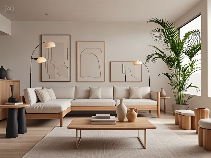
1. Neutral & Earthy Tones
- Colors: Beige, taupe, greige, warm whites, terracotta, olive green, deep brown.
- Effect: Cozy, timeless, and inviting.
- Best For: Scandinavian, bohemian, minimalist, and rustic designs.
2. Monochrome & Minimalist
- Colors: Shades of gray, black, white, and soft neutrals.
- Effect: Sleek, sophisticated, and modern.
- Best For: Modern, industrial, and minimalist interiors.
3. Soft Pastels
- Colors: Blush pink, mint green, powder blue, lavender, light peach.
- Effect: Calming, fresh, and airy.
- Best For: Scandinavian, shabby chic, and contemporary spaces.
4. Moody & Dark Hues
- Colors: Deep navy, charcoal, forest green, burgundy, aubergine.
- Effect: Dramatic, luxurious, and intimate.
- Best For: Modern, gothic, and high-end interiors.
5. Warm & Cozy
- Colors: Mustard yellow, burnt orange, deep reds, warm browns.
- Effect: Energetic, welcoming, and nostalgic.
- Best For: Mid-century modern, bohemian, and eclectic styles.
6. Cool & Refreshing
- Colors: Sky blue, seafoam green, crisp white, light gray.
- Effect: Serene, refreshing, and spacious.
- Best For: Coastal, contemporary, and airy interiors.
7. Jewel Tones
- Colors: Emerald green, sapphire blue, ruby red, amethyst purple, gold accents.
- Effect: Elegant, bold, and luxurious.
- Best For: Glam, vintage, and maximalist styles.